I realized recently that I've turned into a snob when it comes to ... well, most things, but especially makeup and skincare. Even if there was an affordable dupe, I would tend toward the most expensive version simply because of how it would look on my vanity or the assumption that cheaper = lower quality, always. Since that realization I've been making deliberate efforts to try a wide variety of brands.
I'm never going to be the girl with a minimalist makeup collection - I like too many different finishes and colors and I love having the option to wear bizarre colors if I so choose. That said, I don't need to spend $50+ on an eyeshadow palette full of yellows & oranges if I only wear those shades a few times a year, ya feel me? I've done that way too often this year, so when Coastal Scents was having a big sale over the 4th of July weekend, I decided to take advantage of some brights (and neutrals) in order to really give some budget shadows a chance.
Coastal Scents Shadow Pots are typically $1.95 a pop, but they often run half-off sales - I'd recommend waiting until one of these sales so you can load up on $0.99 shadows. Coastal Scents has over 350 shadow pots to choose from, so I tried to take my time and do my research. I chose these shades based on a variety of things: if they were recommended by name through makeup artists I trust, if they were highly reviewed on the Coastal Scents website, and if I could find swatches of them in a blog post. The latter factor is partially what's inspiring me to write this - I could find lots of blog posts with swatches, but not for every shade I wanted to try.
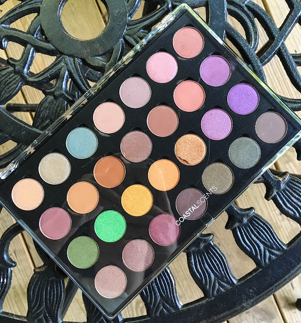
I put together a cool-toned palette and a warms & brights palette using Coastal Scent's 12-pan and 28-pan shadow palettes (which are $6 and $10, respectively). There is an option for a solid black palette, but I prefer clear tops, though they get smudged and dirty, so that I can easily see which shadows are where. The palettes are magnetized, too, so it's easy to pop pans in and out with minimal effort.
Click through for a look at swatches of all 40 shades!
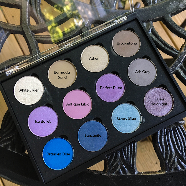
I'll start with my smaller, 12-pan cool toned palette, though it clearly isn't perfectly cool. I do want to mention that I have not played with every shadow for actual eye looks yet, so they could end up performing better with primer or could end up having a lot of unexpected fallout, etc., but as far as swatching goes I was pretty impressed.
As usual, I have to mention my disappointment with brands using "gypsy" as a marketing tool when they probably meant "bohemian" in the first place ... which would've been alliterative and everything!
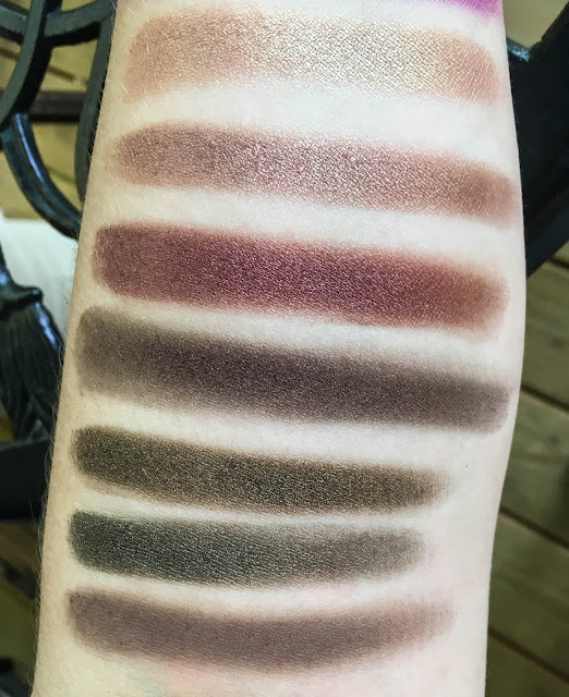
Finger swatches on bare skin (a.k.a. no primer)
+ White Silver | Described as "a shimmering white hue with silver sparks" with sheer application and a shimmer finish. Though it is too shimmery for a browbone shade, I have really loved it so far as an inner corner highlight.
+ Bermuda Sand | Described as "a smooth, brown-taupe hue with a satin finish" with semi-opaque application and a satin finish. I've tried using it as a base eyeshadow, but it's a little too dark and pigmented for that. Bermuda Sand is probably my favorite of the mattes (thus far) and I think it'll be a great crease shade.
+ Ashen | Described as "a light greyish-taupe hue with a satiny finish" with semi-opaque application and a satin finish. Semi-opaque or even sheer is definitely right, but I still think it's pretty and works as a nice, sheer wash of color on more no-makeup days. It blended easily and could be built up through finger application vs. the fluffy brush I used to apply it all over.
+ Brownstone | Described as "a matte shade with a medium brown hue" with opaque application and a matte finish. This is ... my least favorite shadow, I believe. I haven't used it in a look yet, but I'm unimpressed by the patchiness of the swatch.
+ Ice Ballet | Described as "a frosty, pastel purple with a shimmer finish" with semi-opaque application and a shimmer finish. Though the website describes it as such, I was still expecting a white/silver eyeshadow with more of a lavender duochrome flip. Imagine my surprise at receiving a true lavender shimmer! It was soft and pigmented during swatching.
+ Antique Lilac | Described as "a classic twist to pale violet with an opaque, matte finish" with ... obviously ... opaque application and a matte finish. This shade is really pretty, but I had to work to build up that swatch. If they had described the application as sheer or maybe even semi-opaque, I wouldn't be disappointed, but opaque? That's a real stretch. I'm going to keep working with it, since I don't have anything like it in my collection, but just know going into this shade that it's much more sheer than advertised.
+ Perfect Plum | Described as a "satiny, purple shade" with opaque application and a satin finish. Purples seem to be a challenge for most companies, from low end to high end, so I'm happy with the opacity of this one. It applied better with a wet brush (I use Mac Fix+ spray to wet my brushes) and was very pretty, but a little too easy to sheer out.
+ Ash Grey | Described as a "neutral, monochrome hue with an opaque, matte finish". I'll let you guess the intended application and finish. I like how this swatches, but haven't had a chance to give it a fair try yet. I forgot to add a crease shade last night so I tried to layer this into the crease over Perfect Plum and ended up making a bit of a muddy mess. Swatch-wise, though, I feel that this is one of the better mattes.
+ Brandeis Blue | Described as "a cobalt blue shade with a dazzling purple iridescence" with a shimmer finish and opaque application. I'm really happy with how brilliant this shade is! It's another that's better when I pat it on with my fingers, as the brush can blend out a bit of the pigment. I didn't notice any purple iridescence in the pan or on my eye, but that's fine with me as I like this cerulean blue shade as-is.
+ Tanzanite | Described as a "velvety, deep blue shade" with a satin finish and opaque application. This is another shade that I expected to be different than it is, though who knows why - it's a navy satin. Though it's described as "velvety, deep blue" (which, I mean, navy is) I was expecting something a little more special. I found this shadow to be a little difficult to work with - workable, but not worth the effort for me when I have better navy shadows in my collection.
+ Gypsy Blue | Described as "a beautiful haze of light blue with subtle undertones of grey and gold" with satin finish and opaque application. This was really pretty as a inner corner highlight in combination with Brandeis Blue on the lid and Tanzanite on the outer corner. It's very similar to Niagara & I don't know what anyone would need both - of the two, I prefer Niagara.
+ Elven Midnight | Described as a "gleaming gunmetal hue" with a shimmer finish and opaque application. So far I really like this shadow! It's darker than I'd normally choose, but the silvery shimmer finish keeps it interesting. It also leans a little purple, which I like.
And now for my warm/bright palette! After swatching I've realized there are a few shadows I'd like to switch around (for example, Ashen might be better in this palette and Mai Tai might be better in the cool palette, while I could switch Niagara and Gypsy Blue around without ever knowing the difference).
+ Caramel Ice | Described as "a frosted, pale caramel hue with a shimmer finish" and semi-opaque application. So far, it's been a nice brow highlight & inner corner shade. I think it's interesting to see what Coastal Scents considers to be opaque & semi-opaque, though, as I feel that Caramel Ice is a highly pigmented, nice shimmer shadow.
+ Aluminum Taupe | Described as "a dark metallic silver hue with a shimmery finish" and semi-opaque application. This is a gorgeous shade, though I certainly wouldn't describe it as "dark metallic", or silver, or, again, as semi-opaque. It's pale enough to be a pretty inner corner shade and, to my eye, seems to function as a shimmery Bermuda Sand.
+ Niagara | Described as "a wash of bluish-green with a shimmery finish" and opaque application. To me, Niagara functions the way I expected Gypsy blue to, and it comes across as a pale blue-gold duochrome. Right now I'm wearing it on my inner corner and under my eye as a liner, and I'm really loving it in combination with 18 Karat Gold on my lid and Kodiak on my outer corner - the combo pulls out the greeny-gold of Niagara while still adding the brightness of a pastel blue.
+ Victorian Pear | Described as "a creamy off-white hue with a slight green tint" and a satin finish with sheer application. It is sheer and pretty, more of a dusty rose than an "off-white". In the pan I could see light green sparkles, but they didn't translate in the swatch or on the eye. I'm not sure how to use it yet, but I think it's pretty and I want to incorporate it.
+ Mai Tai | Described as "an indulging mauve hue with a silver shimmer" (lol... indulging...) with a shimmer finish and semi-opaque application. I love this shadow so much more than I thought I would when I placed the order. It's almost a silvery dusty pastel purple and I don't have anything else like it. I'm in love.
+ Mauve Frost | Described as "an icy pink hue with an ultra shimmer finish" and opaque application. Icy pink is right, much more so than "mauve". This looks bright in the swatch, and it can be, but it also works in the inner corner as a highlight if you use a light hand. I'm really liking it.
+ Canyon Coral | Described as "a deep bronze-coral hue" with a satin finish and semi-opaque application. Pretty, pigmented, and on-trend, but another shimmer that's more opaque than semi-opaque.
+ Antique Maroon | Described as "a rustic, brownish-red hue with a satiny finish" and opaque application. I haven't tried it yet but it looks super wearable.
+ Oatmeal Tan | Described as "a light tan hue with a matte finish" and semi-opaque application. Oatmeal Tan & Oktoberfest were the most widely recommended shades from Coastal Scent's entire line of shadow pots. Initially ... I was disappointed. It took some effort to build up and the swatch wasn't great. However, when using it on my eye, I actually loved it. It was easy to build up and blend out and wasn't patchy. A great neutral shade.
+ Oktoberfest | Described as a "burnished" (you keep using that word... I do not think it means what you think it means) "orange-brown hue with a matte finish" and opaque application. My opinion on this is the same as for Oatmeal Tan!
+ Burnished Wine | Described as "a rich, burgundy-brown hue with a shimmer finish" and semi-opaque application.This is super shimmery with almost a foil finish, particularly when applied with Mac Fix + spray.
+ Earth Rose | Described as "a dusty red hue with a satin finish" and semi-opaque application. LOVE this shade way more than anticipated. I haven't worn it yet but I wonder if it could be a crease shade, even with the satin finish.
+ Paprika | Described as "a rich, orange-red hue with a smooth, matte finish" and semi-opaque application. This was another highly recommended shade that disappointed me during swatching, but again I have actually really liked it in the crease for pink-toned eye looks.
+ Tyrian Purple | Described as "a deep, reddish purple hue with a silver shimmer finish" and semi-opaque application. This one is more subdued than I expected - I thought it would be the brightest of any of the purple shades, but I like it. Haven't tried it on the eye yet so we'll have to see how it works.
+ Cherry Moss | Described as "a reddish-brown hue with green iridescent shimmer" with opaque application. I wouldn't describe it as opaque, as it swatches rather sheer, but it is a unique shade in my collection that has an almost-duochrome flip from peachy to green-gold, depending on how the light hits it. Definitely worth playing with!
+ Amaretto | Described as "a luxurious reddish-brown hue with a shimmer finish" and opaque application. Amaretto is a super pretty shadow. In person, it almost looks like a dusty rose shimmer (maybe a little more brown than that). It feels buttery to the touch and I'm a fan.
+ Raisin Berry | Described as "a stunning maroon" with shimmer finish and opaque application. So far I've used Raisin Berry as an outer corner/bottom lid liner shade on a pinky-purpley eye look, and I really like it. Pigmented and blendable.
+ Cherry Chocolate | Described as "a rich reddish-brown hue" with a shimmer finish and opaque application. Meh. I'm not super impressed with Cherry Chocolate - it feels more stiff & dry in the pan than the other shimmer-finish shadows, and swatches patchily because of it. It seems to be a matte dark brown shadow with pink shimmer sparkles, creating the "cherry chocolate" effect.
+ Kodiak | Described as "a shimmering golden brown hue" with opaque application. Kodiak looks olive in this image, but in real life I think it's a much more functional, creamy deep brown shade than Cherry Chocolate, but with golden shimmer rather than pink.
+ Dark Golden Olive | Described as "a shimmering deep green hue with iridescent gold sparks" and opaque application. It is exactly as described - buttery, pigmented, and true olive green with golden shimmer.
+ Timeless Taupe | Described as "an antique brownish-grey hue with a matte finish" and semi-opaque application. Mattes seem to be Coastal Scents weaker shadows, in my opinion. but Timeless Taupe isn't too bad. Describing it as semi-opaque is fair, and it can be built up to opaque with little effort. It's a nice matte crease shades to round out all of the shimmer shadows!
Since I started writing this post (it's taken me weeks to finish up - my lack of motivation is truly astounding) Coastal Scents has already had another half-off shadow pot sale, so I'd definitely keep an eye out! At $0.99 per shadow, these are absolutely worth it. Some shades are obviously stronger than others, but the fact that some of them perform just as well as my Anastasia, Marc Jacobs, or Kat Von D shadows goes to show the extreme mark-up on makeup products. If you're looking to try out funky new colors that you aren't sure you'll incorporate into a normal makeup routine, I'd say Coastal Scents is the way to go rather than dishing out ~$50 on something like Urban Decay Electric or colorful Kat Von D singles. I'm a fan!


Post a Comment